RE-DESIGN

Community Page Navigation Redesign – ApartmentRatings.com

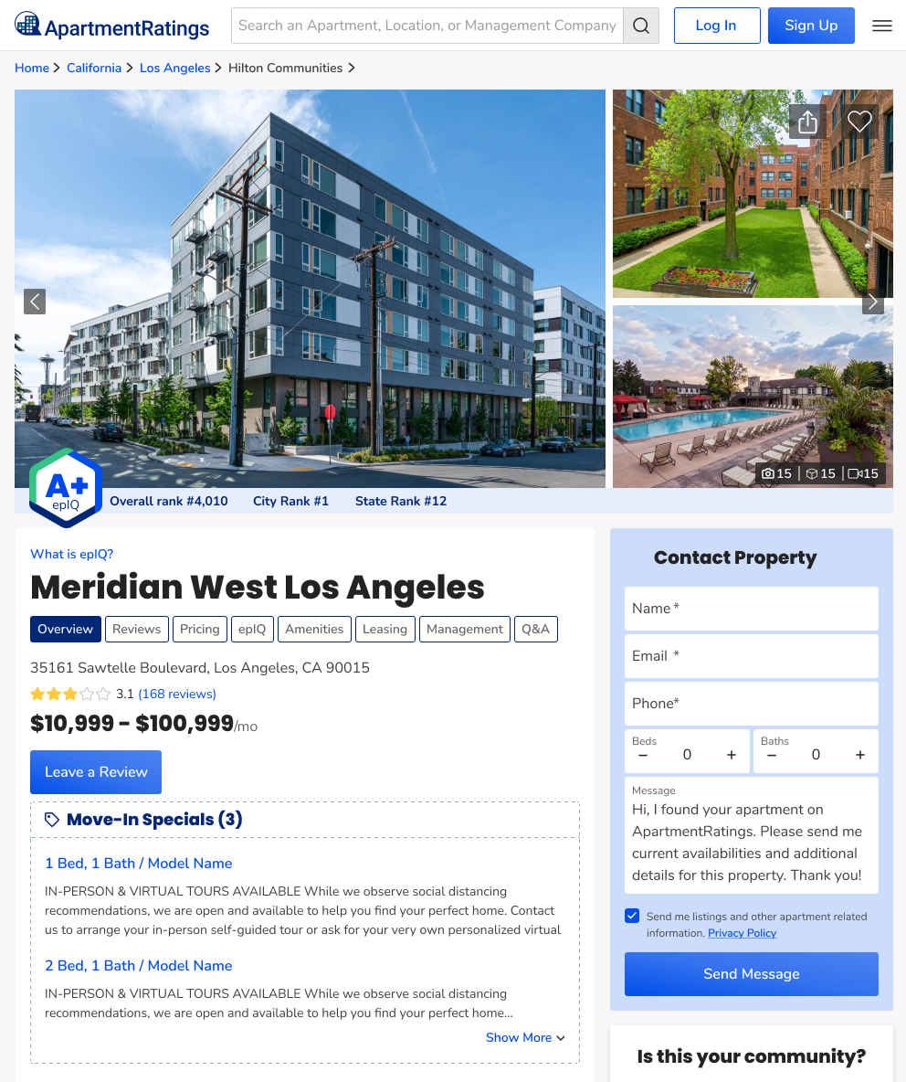
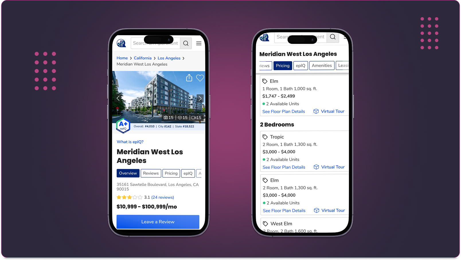
Making complex property info easy to explore

Community Page Navigation

Context & Problem

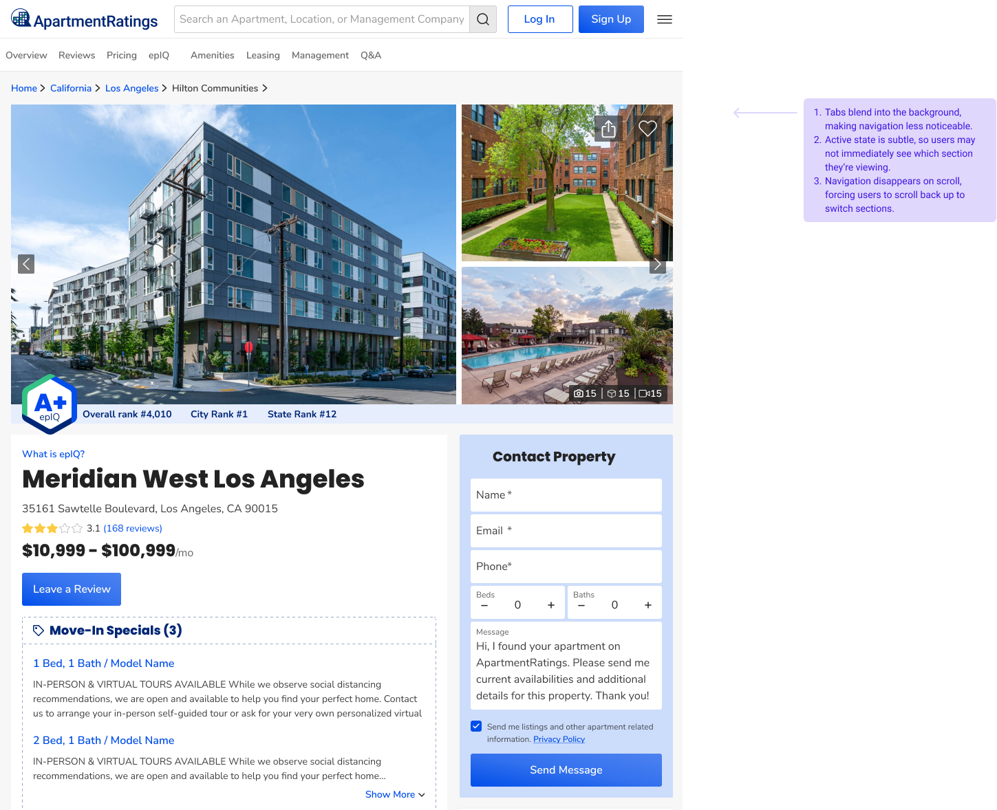
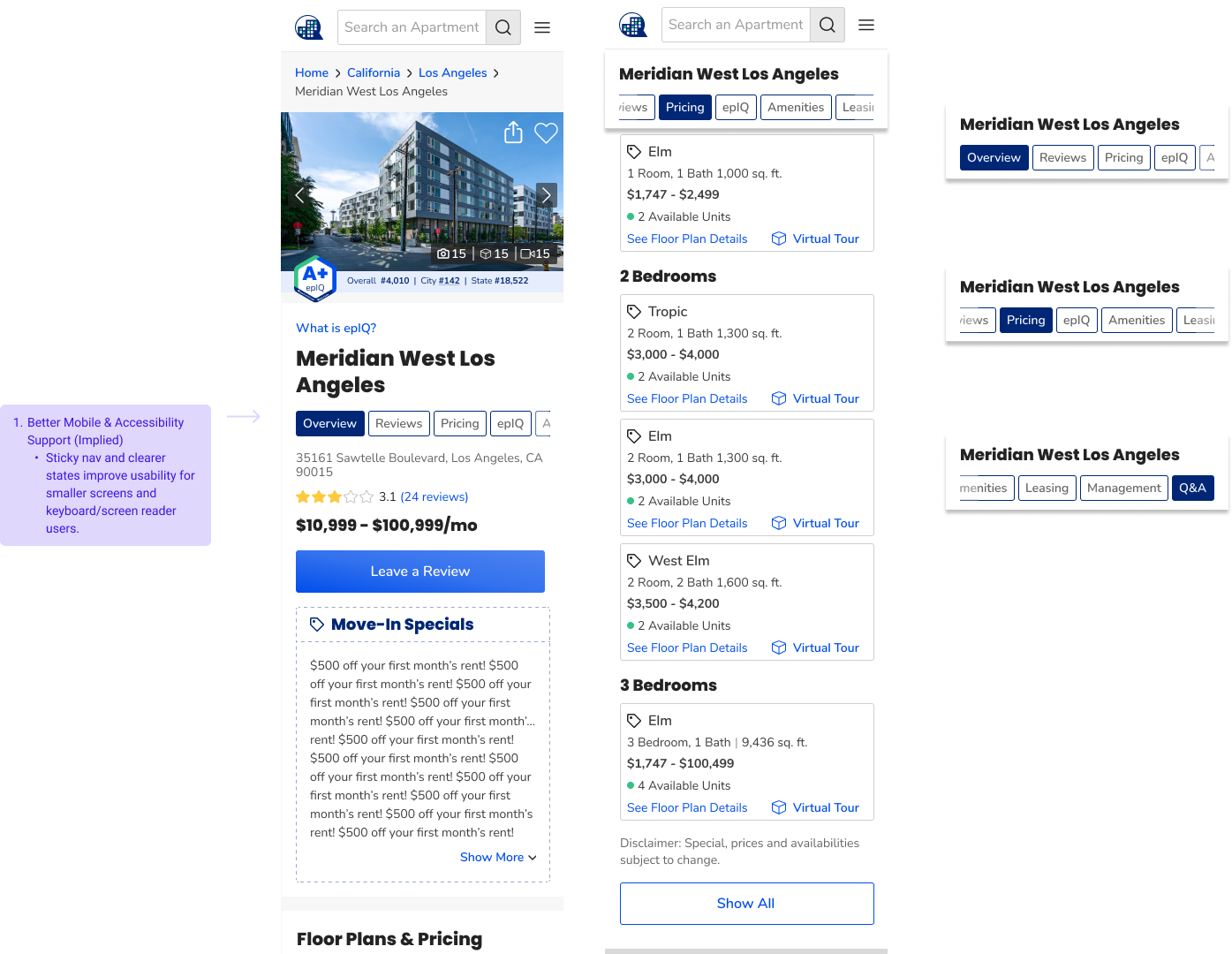
The community page navigation was cluttered and inconsistent, making it difficult for users to find key content like photos, videos, reviews, and floor plans. This slowed decision-making and led to missed engagement opportunities.

Solution (V1)

I redesigned the navigation to create a cleaner, more intuitive experience by:

  • Grouping related content into clear categories (e.g., Photos & Videos).
  • Prioritizing high-value sections (Reviews, Photos/Videos, Floor Plans) based on analytics.
  • Streamlining mobile navigation with collapsible menus for smaller screens.
  • Aligning typography, spacing, and icons to ensure design consistency.

Before Redesign

Community Page Navigation Before Redesign

After Redesign

Community Page Navigation After Redesign

Default IF no spill over - all content fits

Community Page Navigation Default State

Default (only right active) IF after expanding ever a spill over

Community Page Navigation Spill Over State

Left and Right Active

Community Page Navigation Left and Right Active

Only Left Active

Community Page Navigation Only Left Active

When Scrolling below

Community Page Navigation When Scrolling below

Mobile version

Community Page Navigation Mobile version

Iteration (V2 – In Progress)

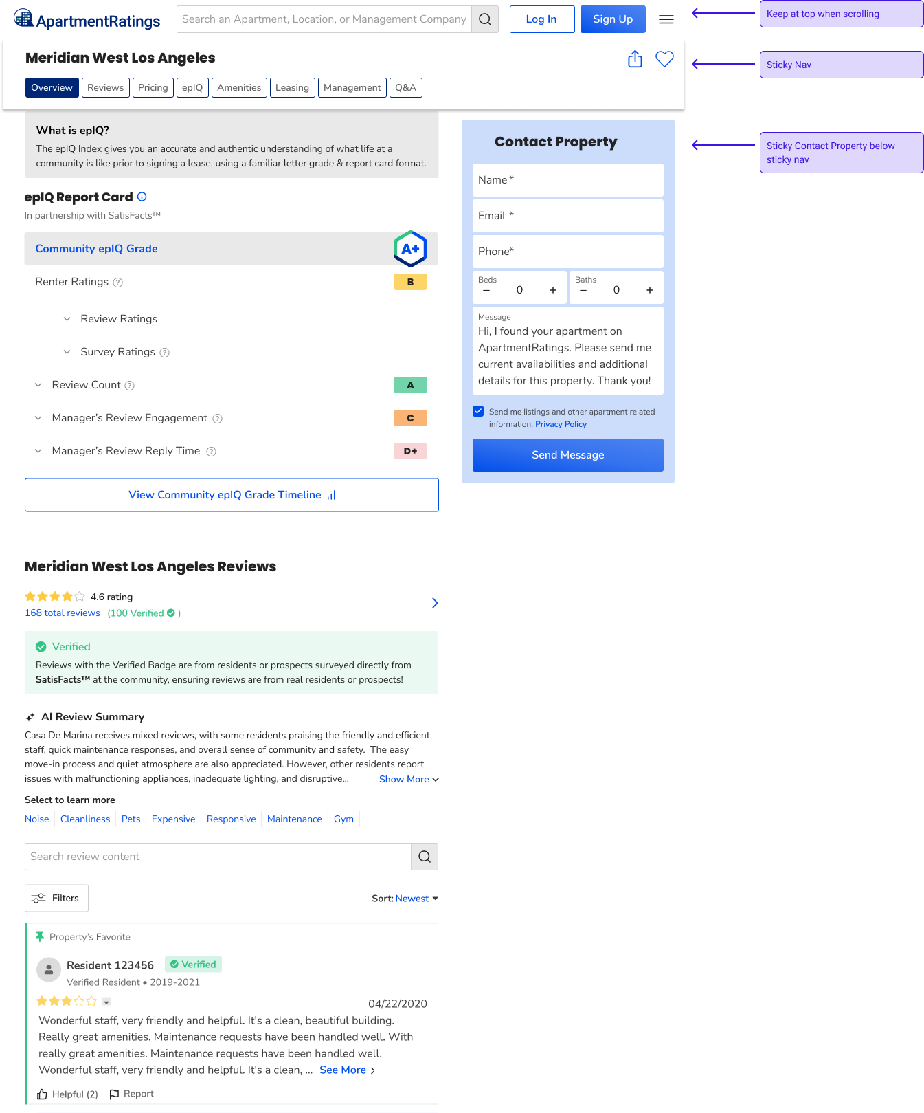
Based on feedback and analytics, we're further refining the navigation to:

  • Improve visibility of secondary content without clutter.
  • Test different layouts for faster access to high-traffic sections.

My Role

Sole UX designer for the redesign. I conducted a competitive analysis, reviewed analytics to identify high-traffic areas, and collaborated with product and engineering to bring the new navigation to life.

Impact

  • Increased traffic to community pages by 11% post-launch.
  • Faster access to key content, improving decision-making.
  • Higher engagement with high-value content (photos, videos, reviews).
  • Better usability on mobile devices.
  • Stronger alignment with modern design patterns and brand guidelines.

How We'll Measure Success

  • Increased click-through rates to high-value sections (e.g., Reviews, Photos/Videos).
  • Decreased bounce rate on community pages.
  • Improved time-on-page for review and photo sections.
  • Positive feedback in usability testing post-launch.